Friday, 26 May 2017


Thursday, 25 May 2017
M4- How does the exported media meet the client brief.
M4- How does the exported product meet
the client brief.


On the double page spread, the conventions included that link to the client brief is that in the description of the artist, it states that he is “one of the most popular rising grime artists in north london”, which shows that the artist the magazine is featuring is very popular in North London, also a question featured in the article was about the artist growing up in North London. This can relate to the main target audience of the magazine which is people or mainly teenagers who live and grew up in North London so they can possibly feel how he felt when growing up if they had similar family problems or lived in poor conditions so they can relate to that and find out how he overcame the bad times which can help the audience do that as well.
Monday, 27 March 2017

Sunday, 26 March 2017
Review of the suitability of Front cover and Double page spread.P5

An advantage of the front cover is that it is eye catching and would attract the eye if it was to be sold on shelves in the shops, this gives us an advantage over the competitors as it will make the reader want to purchase the magazine over other competitors which increases the chance of the magazine succeeding and selling.
However a disadvantage of the front cover is that it still needs some editing to make it look more professional to be sold in shops, this is because at the moment the front cover doesn't look as professional as other magazines as there are still some blank spaces and the social media logos aren't the same size, so by editing this and making it look more professional, this helps the magazine look more attractive to the audience.


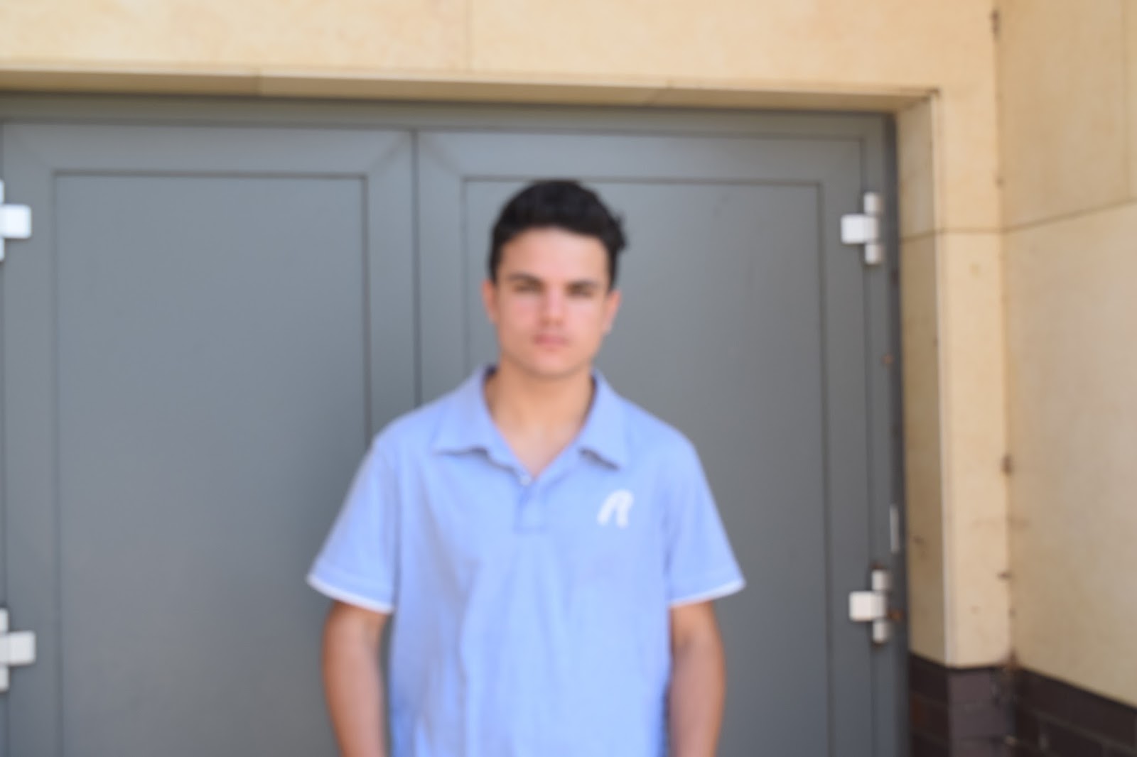
Double Page Spread: I believe that the double page spread is also suitable for the target audience, this is because the fonts are suited to the genre well and the article is what the target audience would be interested in reading. I also think that the whole design of the double page spread looks attractive and modern which helps make the audience want to look at the whole page and enjoy reading it. The improvements that I would make to the double page spread is the colour scheme, I would’ve preferred a darker blue to a lighter blue on the background of the first page and also for the questions in the article, and also I would’ve made the colour on the description on the top right corner a bit lighter so it is easier to read. The last improvement that I would make is I could’ve fit more text in the article because there is a bit of blank space at the bottom of the article so I could’ve filled that to make it look more attractive and neat.

A disadvantage of the double page spread is that the fonts are quite hard to read, this is a disadvantage because the reader may not be able to read the text, this would put a bad reputation on the magazine as the audience will think it is not worth purchasing if they can't read the text and this would also restrict the reader from purchasing a future copy of the magazine.
Equipment Preparation and Photoshoot - P4


Ive adjusted the camera angle slightly but left the tripod height the same.

Ive moved the tripod higher and adjusted the camera angle slightly.
Here are some of the photos I took during my photoshoot. I decided to use some different shot types and focused on the mise-en-scene.

 My initial idea changed following the further feedback i received that the photos didn't match the genre.
These are original photos from the shoot:


P5 - evidence of post production techniques
P5- evidence of post production techniques


Anchorage on Front cover:


Front Cover puff:
For the puff on the front cover i used the shape tool on photoshop to create a circle. I also used a stroke on the circle to give it an inner glow by using black and i also used an outer glow by using red. I used these colours so it links with the colours of the masthead and i believe that it also links well with the genre.
Font tools for quote on double page spread:
Font tools for quote on double page spread:
For the main quote on the double page spread i used the stroke tool to give the text a black outline, i did this because it makes the writing look more bold and interesting as well as it makes the text stand out so the reader will acknowledge it first when they turn the page, this affect has also been used on the text to show that it is an important text within the double page spread.

Anchorage on Front cover:
For the anchorage on the front cover i used the stroke tool to give the anchorage an inner and outer glow, i used the colours black for the inner glow and red for the outer glow. I used the stroke tool so it makes the anchorage stand out more by being more bold and colourful. I used the colours black and red as these are the main colours within the magazine, also the masthead in the magazine is also red and black and the anchorage is placed directly below it so it would look better and neater if both the masthead and anchorage shared the same colours.

Double page spread gradient tool:
On my double page spread i used the gradient tool to create a gradient effect so the colours go from darker to lighter from one page to another. I used this so it makes the double page spread look more attractive to the audience rather than using a plain white background.
Subscribe to:
Comments (Atom)