Front Cover puff:
For the puff on the front cover i used the shape tool on photoshop to create a circle. I also used a stroke on the circle to give it an inner glow by using black and i also used an outer glow by using red. I used these colours so it links with the colours of the masthead and i believe that it also links well with the genre.
Font tools for quote on double page spread:
Font tools for quote on double page spread:
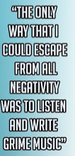
For the main quote on the double page spread i used the stroke tool to give the text a black outline, i did this because it makes the writing look more bold and interesting as well as it makes the text stand out so the reader will acknowledge it first when they turn the page, this affect has also been used on the text to show that it is an important text within the double page spread.

Anchorage on Front cover:
For the anchorage on the front cover i used the stroke tool to give the anchorage an inner and outer glow, i used the colours black for the inner glow and red for the outer glow. I used the stroke tool so it makes the anchorage stand out more by being more bold and colourful. I used the colours black and red as these are the main colours within the magazine, also the masthead in the magazine is also red and black and the anchorage is placed directly below it so it would look better and neater if both the masthead and anchorage shared the same colours.
Double page spread gradient tool:
On my double page spread i used the gradient tool to create a gradient effect so the colours go from darker to lighter from one page to another. I used this so it makes the double page spread look more attractive to the audience rather than using a plain white background.


No comments:
Post a Comment