An advantage of the front cover is that it is eye catching and would attract the eye if it was to be sold on shelves in the shops, this gives us an advantage over the competitors as it will make the reader want to purchase the magazine over other competitors which increases the chance of the magazine succeeding and selling.
However a disadvantage of the front cover is that it still needs some editing to make it look more professional to be sold in shops, this is because at the moment the front cover doesn't look as professional as other magazines as there are still some blank spaces and the social media logos aren't the same size, so by editing this and making it look more professional, this helps the magazine look more attractive to the audience.


Double Page Spread: I believe that the double page spread is also suitable for the target audience, this is because the fonts are suited to the genre well and the article is what the target audience would be interested in reading. I also think that the whole design of the double page spread looks attractive and modern which helps make the audience want to look at the whole page and enjoy reading it. The improvements that I would make to the double page spread is the colour scheme, I would’ve preferred a darker blue to a lighter blue on the background of the first page and also for the questions in the article, and also I would’ve made the colour on the description on the top right corner a bit lighter so it is easier to read. The last improvement that I would make is I could’ve fit more text in the article because there is a bit of blank space at the bottom of the article so I could’ve filled that to make it look more attractive and neat.
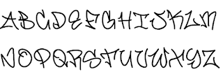
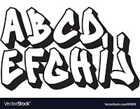
A disadvantage of the double page spread is that the fonts are quite hard to read, this is a disadvantage because the reader may not be able to read the text, this would put a bad reputation on the magazine as the audience will think it is not worth purchasing if they can't read the text and this would also restrict the reader from purchasing a future copy of the magazine.


No comments:
Post a Comment